The Button Control
![]()
The Button object is used to allow easy access to a function on the application such as Save, Scan, Submit, or Exit. This object can only be seen in the graphical client and supports images on the button itself.
When the AllowFocus is set to true, you can enable the user to backup to the prior control (AllowBackup = True), and/or allow a FocusOnClick event, and/or allow an OnEnter event where you can select the action for the OnEnter event. For example the OnEnter event can be set to execute one of these actions: Advance the cursor to the next prompt, Exit the Form, Hold the Focus, go to the next page, reset the form, or submit the values.
When AllowFocus is set to false, the ClickAction property enables/disables action executed by the OnClient event. For example if the ClickAction is False the action is prevented, but if set to True, then the OnClick action is allowed. The OnClick actions are the same as the ones for the OnEnter listed above.
To use a button, place it on the application and give it the appropriate caption. In text mode, the GotFocus, OnEnter and LostFocus events are executed when the image is next in the tab order. In the graphical mode, the Click event will also execute.
Note: This prompt will never hold the focus. When focus comes to this prompt it immediately processes the event and focus then moves to the next prompt.
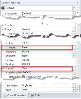
To set whether an image on the Button control is visible or not, you can set the Image, Visible property to True.
To disable the press animation and set whether the image on a button is visible or not, set the Pressed property to False and the Image, Visible property to True.

Note: If the image type is an icon (or has an Icon Name) and you have the image visibility turned off, the Icon size and margins will be considered when determining control auto-size but will be ignored during final layout. This allows an auto-sized control to toggle the visibility state without changing sizes. This allows an auto-sized control to toggle the visibility state without changing sizes.
For property descriptions, see Graphical Control Properties.